The creation of the landing page...
The landing page is definitely one of the pages I had the most difficulty with while creating. Although the 'click to enter' portion was something I knew I definitely wanted, the image above that text was something I struggled with envisioning. I knew I wanted to invoke some kind of blissful, peaceful feeling for the first page of this site with a piece of my art but to create something with that general and broad emotion in mind lead to a lot of different concepts.
The first picture I had in mind to use in the landing page was basically a picture of my mascot/OC reaching for the 'click to enter' sentence. He was meant to look like he's falling towards it so his image would be upside down, and the 'click to enter' phrase would have been glowing and emitting a light against the face of the character. I also pictured roses and petals to be around him, and the ribbons in his design that wrap around his arm and leg to be unravelling.

As you can see, I didn't get very far at all when it comes to drawing out this first concept. I think the way I wanted to set up the lighting made everything feel much more intense than I desired, and the face looked a little... too realistic to me, at least compared to my usual style. I kept feeling like the face and hair of what I was drawing didn't match the original concept, so I scrapped it.

The second concept I was going for was a lot more straight-forward but also simply boring and didn't at all fit the concept of what I wanted the enter page to be. I got even less far trying to draw this one out:

The third concept was really cute and I liked it because of its simplicity and ability to fit into the concept I desired, but was ultimately given up because I'm not very good at chibi proportions. I had the idea that I would have drawn a background that perfectly fit the grass and sky and had some more birds in it. I would love to revisit this idea and really make it good, but for some other page. I'm grateful for even coming up with this concept and trying it out because simplifying the hair of this character has made it even easier (and more fun) to draw him now.

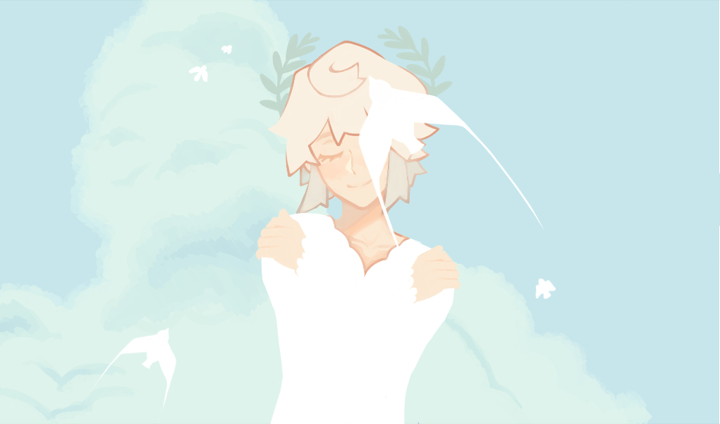
It feels pretty obvious, to me at least, as to why this concept was chosen as the final one. I loved drawing the huge cloud and birds (despite how simple they are) although getting the right color down for the background was pretty difficult. I wanted to stick with something gentle and warm but not too blue, which also was kind of hard when not wanting to let the olive branches in my character's hair fade into the background. Because of this, I didn't know whether or not to leave the background white (to make a REAL stark contrast of my character and the background) or to keep the background.

Ultimately, I decided to touch up a few things and leave the background of the image that greenish color and use this as my final image. I think it turned out pretty good, but I'll definitely go back to it to change some things when I feel like doing so. I've stared at it a little too long, now.